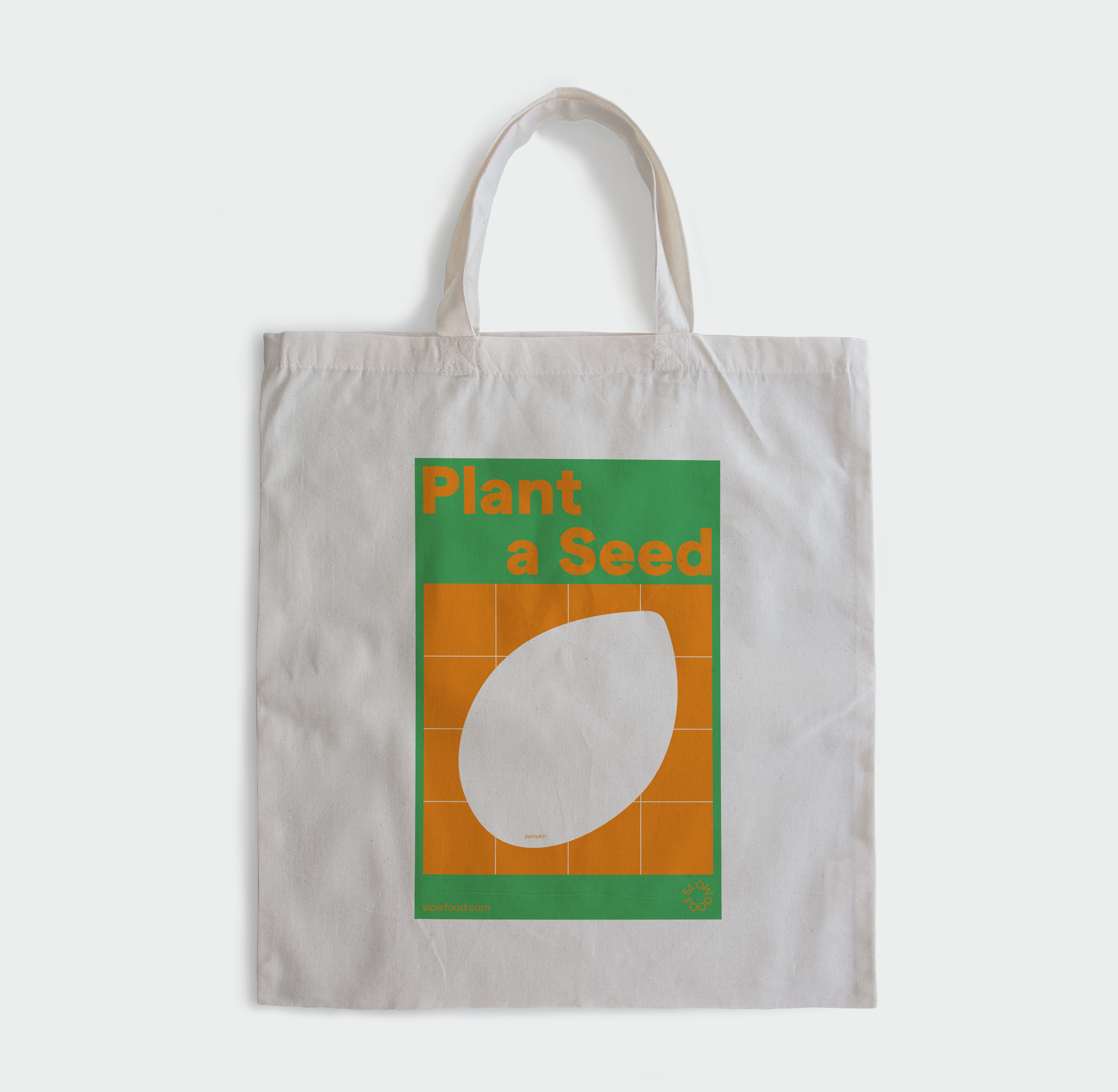
Slow Food
Brand Identity, Art Direction
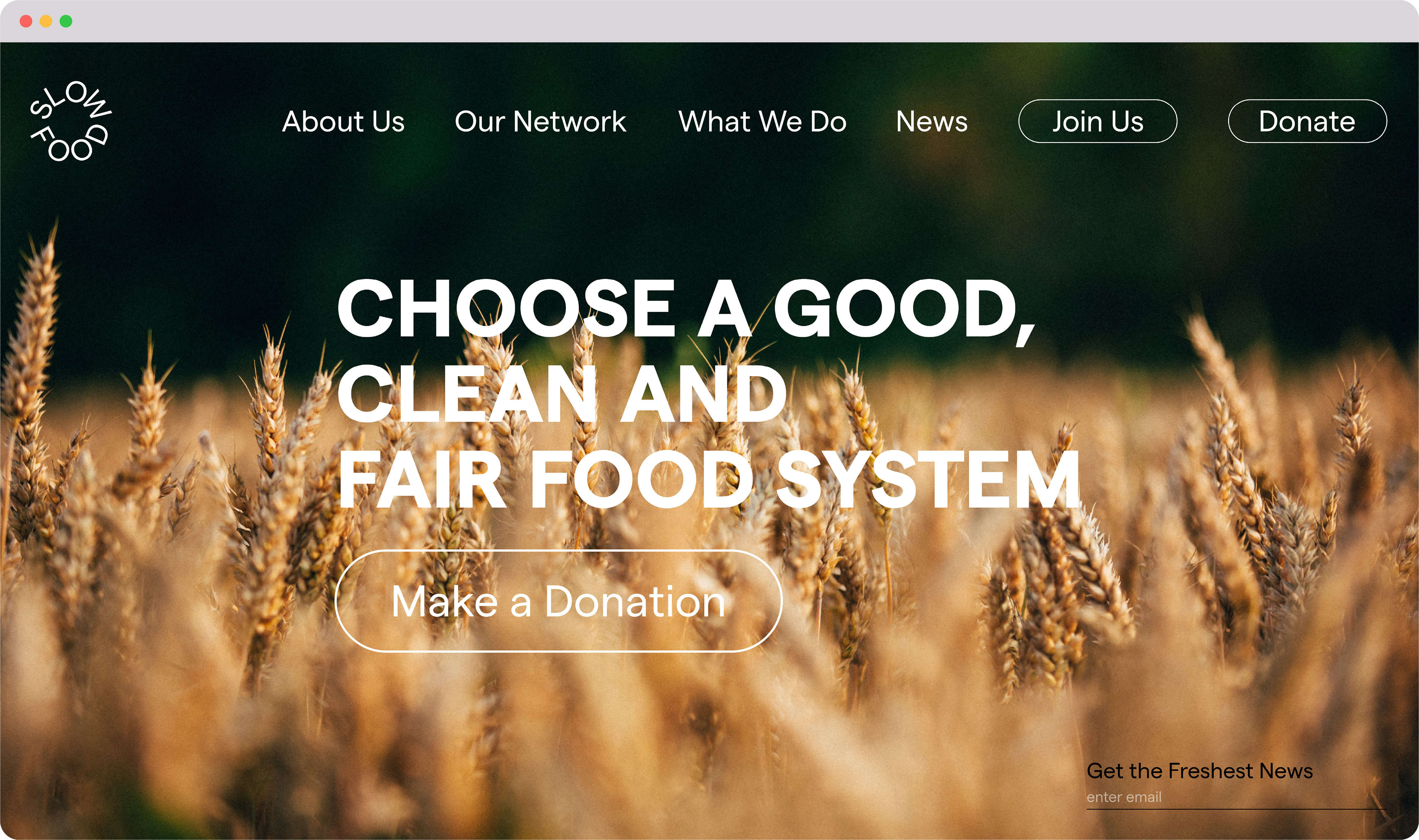
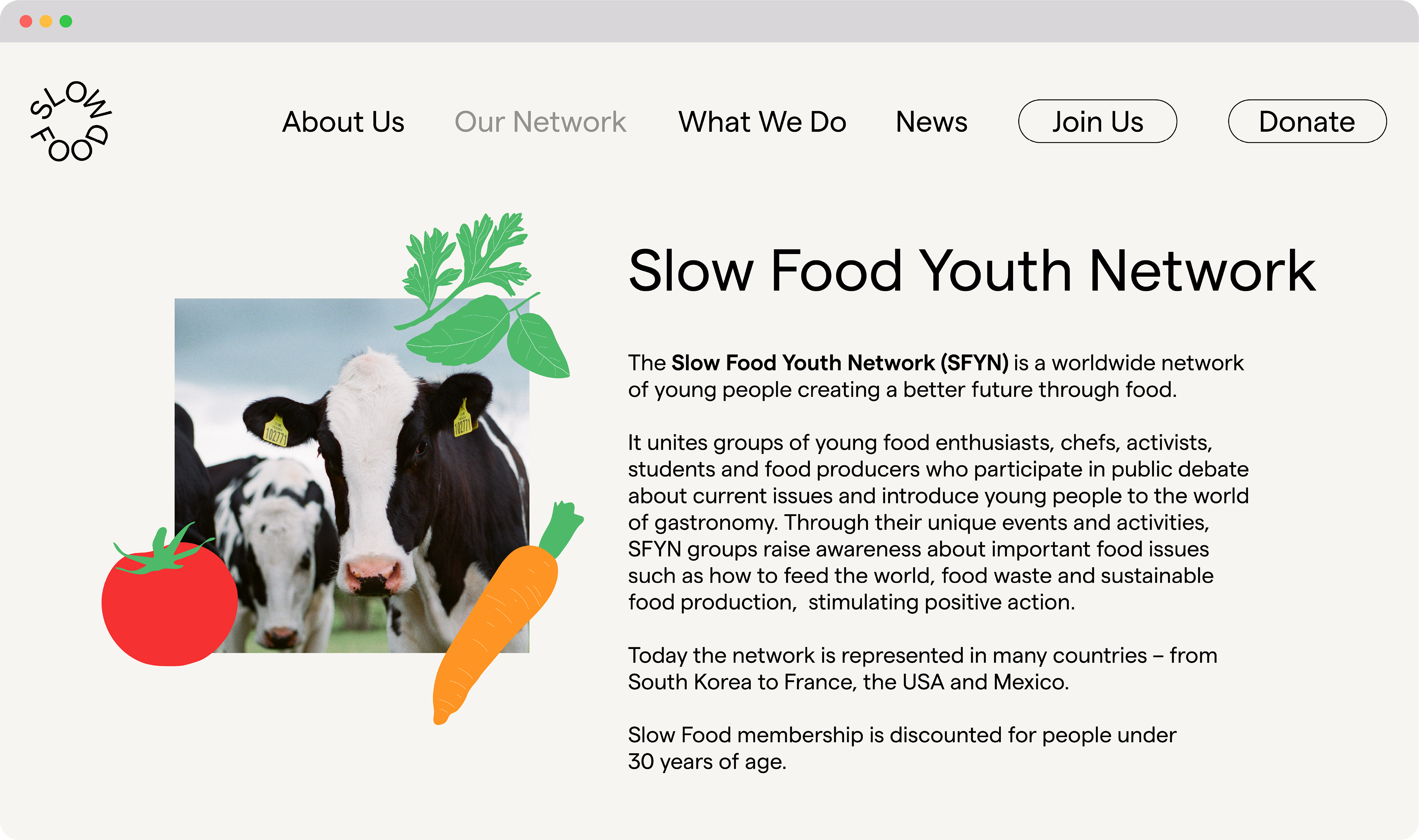
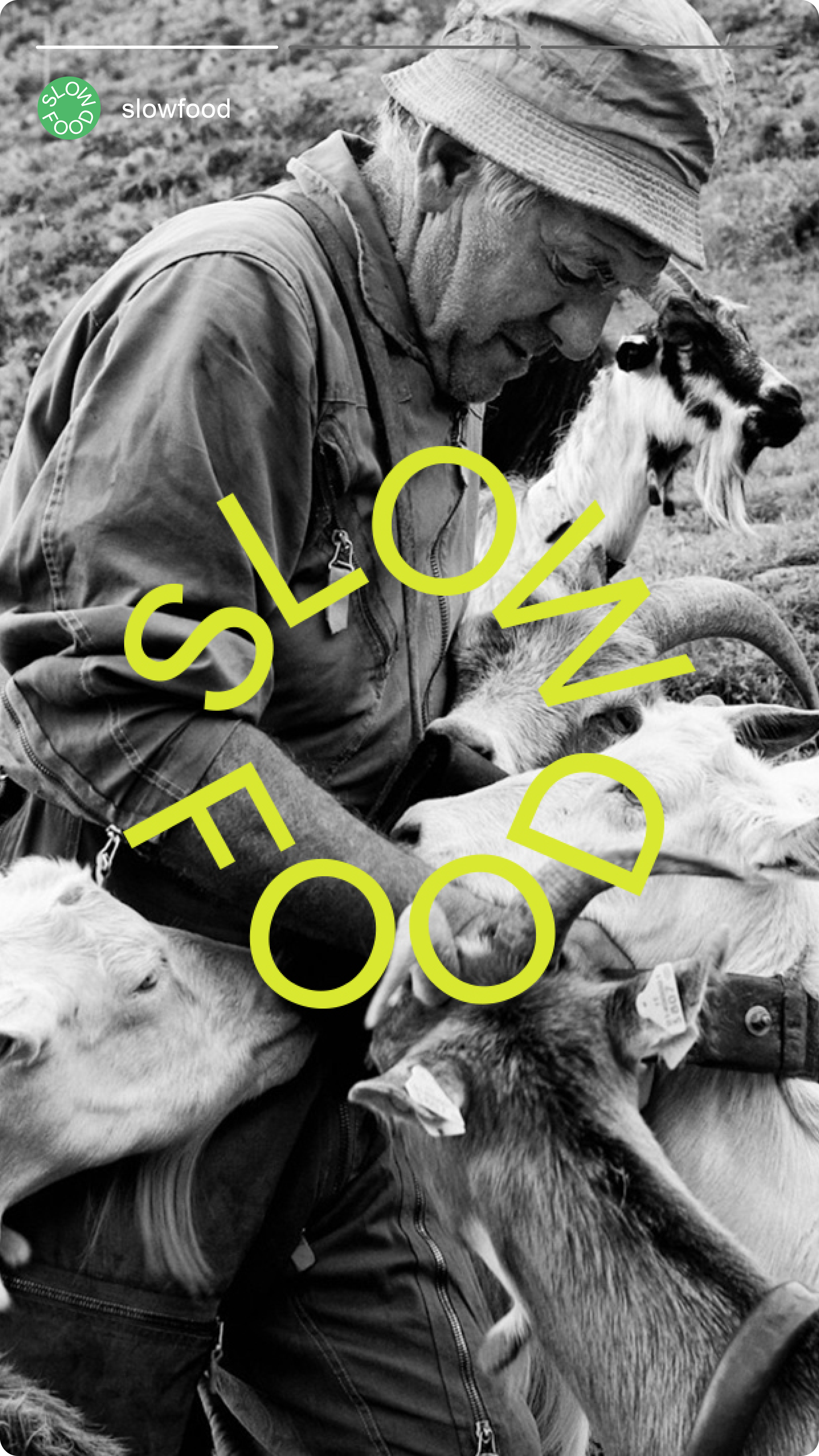
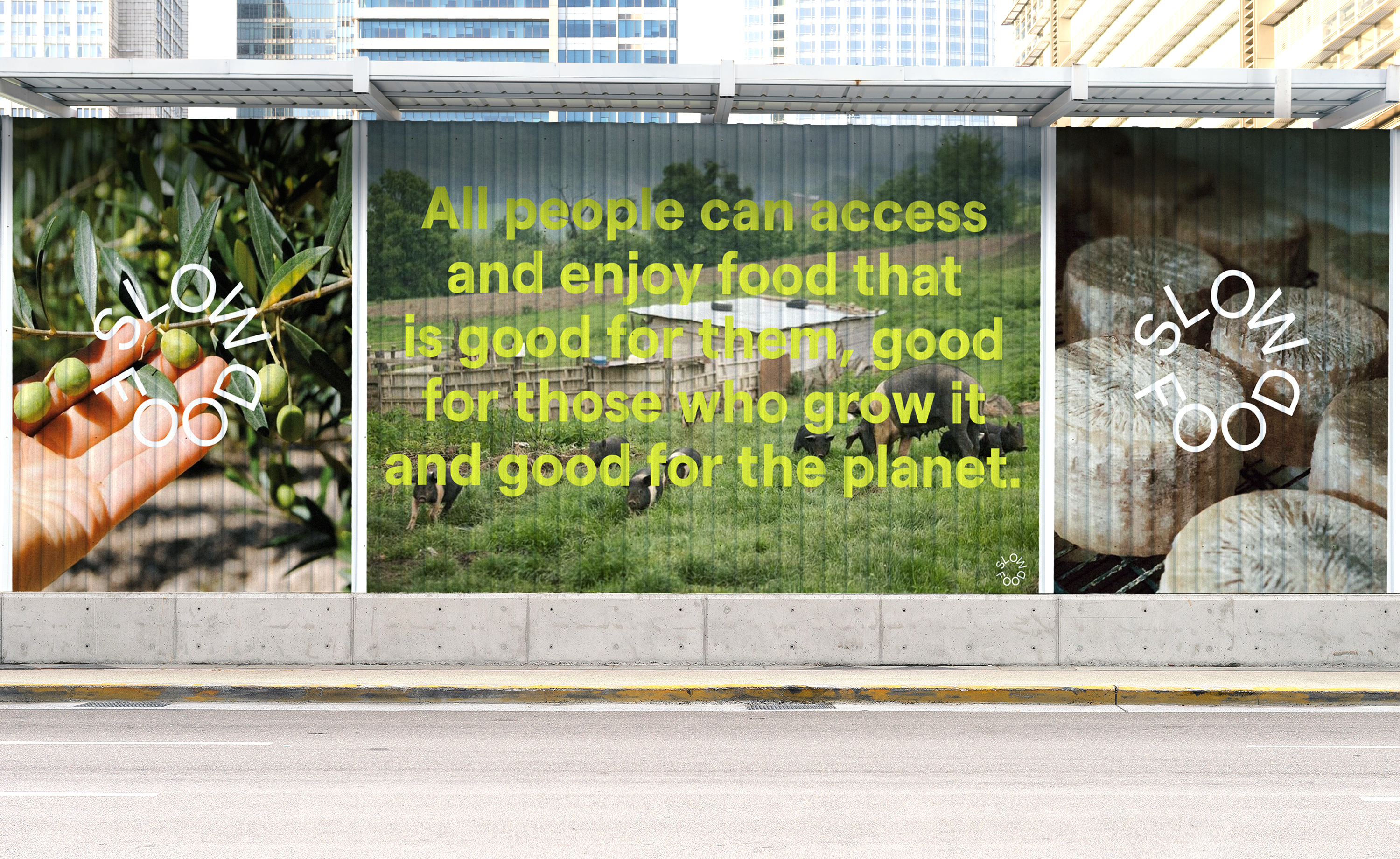
Slow Food is a global, grassroots organization to prevent the disappearance of local food cultures and traditions, counteract the rise of fast life and combat people’s dwindling interest in the food they eat, where it comes from and how our food choices affect the world around us.
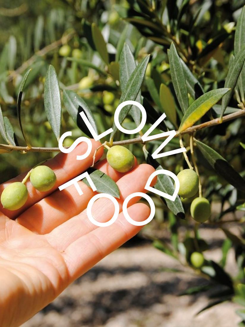
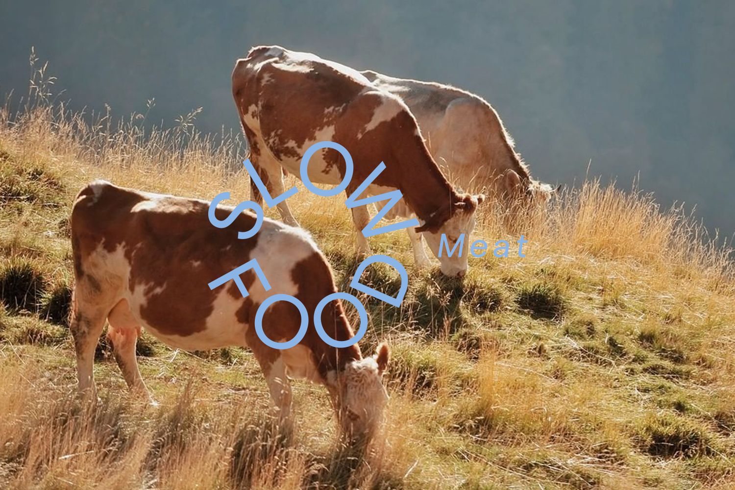
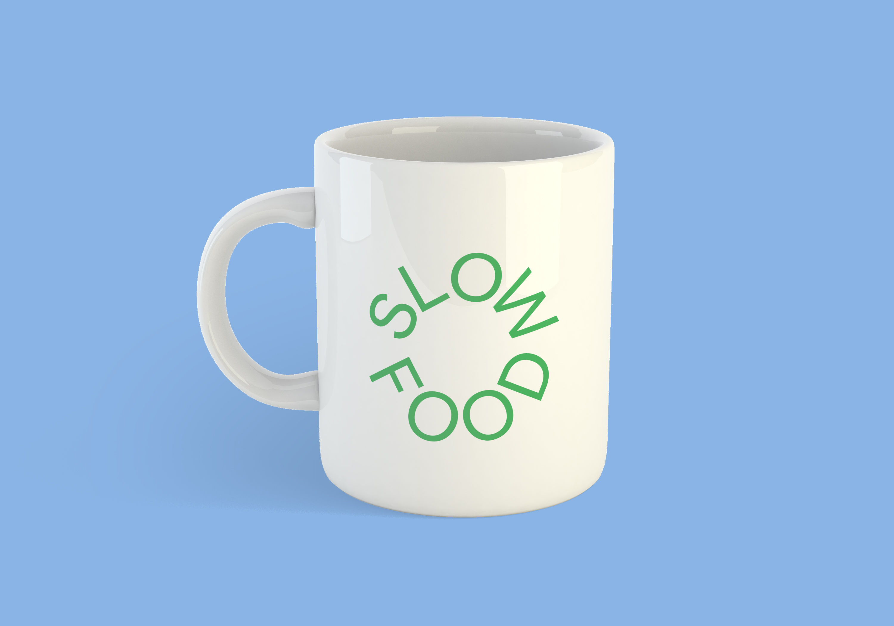
I started by refining Slow Food’s existing logo, a snail symbol of slowness. I aimed to create a logo with a circle shape that denotes our Earth, sustainability, the Sun. I also wanted to create a logo that can be used both for a wordmark and a symbol.
I started by refining Slow Food’s existing logo, a snail symbol of slowness. I aimed to create a logo with a circle shape that denotes our Earth, sustainability, the Sun. I also wanted to create a logo that can be used both for a wordmark and a symbol.